How to Create a 3-Dot Menu on Mobile
Video Tutorial
Article:
Please Note: This is an alternative to using our menu element, we recommend you try that first to see if it suits your needs. On mobile, this create a hamburger menu with a similar appearance to the three dot. Check it out here.
If you want to add a 3-dot menu in your mobile view for easier navigation, here’s how to do it.
-
Firstly, source an icon for the menu. It could be 3 dots, or 3 lines stacked. In the Page Builder, click Image in the Elements toolbar and upload your icon. Then click to select and add it to the page.
-
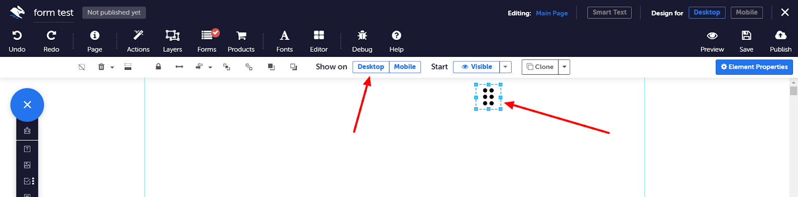
Give this element a name like 'dots' in the Properties panel. Then, click Show on Desktop to grey out that option. This means the icon will only be visible on mobile.
-
Next, add an X icon that will allow people to close the menu. There are two options: upload an X icon the same size as your three dots and add it as an image. Or, add a Text element, enter “X” and make the font a larger size and bold. Give this element a name like 'X' in the Properties panel. Then, click Show on Desktop to grey out that option. This means the icon will only be visible on mobile.
-
Click Layers in the top toolbar, then New Layer. Give it a name like “mobile menu”, and click OK. Click Mobile to make it shown on mobile, and make sure it's set to Start Hidden.
- Select your layer to edit it. Then, add a panel element from the elements tray. Adjust and resize, then add your menu links, making sure they're contained within the panel.
- Click Mobile to enter mobile view. Deselect your menu layer to edit the main page. Remobilise, or move your X and dots icons roughly where you want them to be.
-
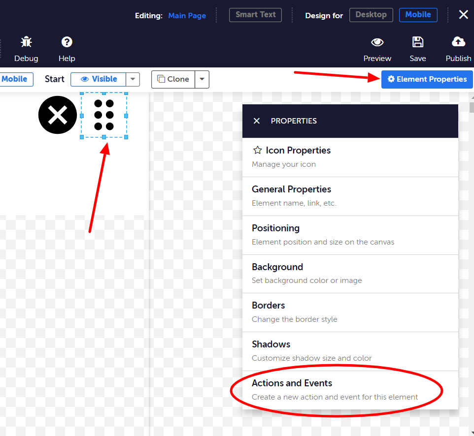
Select your 3 dots icon, and go to Properties panel > Actions and Events.
Click Add New Action, and configure the action as follows:
Event Type > On Click
Action > Show
Target > (your mobile menu layer) and switch on Include Contained Elements
-
Click Done. Click Add New Action, and configure the action as follows:
Event Type > On Click
Action > Hide
Target > (your dots icon) and switch off Include Contained Elements
-
Click Done. Click Add New Action, and configure the action as follows:
Event Type > On Click
Action > Show
Target > (your X icon) and switch off Include Contained Elements
-
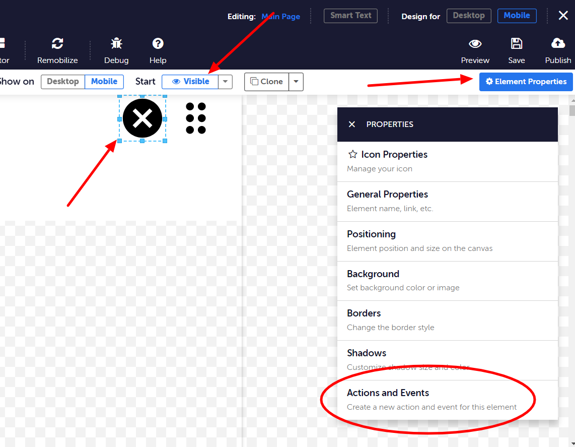
Next, select your X icon, and click Start Hidden. Go to Properties panel > Actions and Events.
Click Add New Action, and configure the action as follows:
Event Type > On Click
Action > Hide
Target > (your mobile menu layer) and switch on Include Contained Elements
-
Click Done. Click Add New Action, and configure the action as follows:
Event Type > On Click
Action > Hide
Target > (your X icon) and switch off Include Contained Elements
-
Click Done. Click Add New Action, and configure the action as follows:
Event Type > On Click
Action > Show
Target > (your dots icon) and switch off Include Contained Elements
- Finally, position the X icon over the 3 dots icon.


You’re finished! Don’t forget to save your page and hit Preview. To preview the mobile view in Chrome, right-click in Preview mode and click Inspect. Click the smartphone icon and choose a device to view your page on. You’ll now be able to click on your menu and see it work.
NOTE: if you have a long menu, you need to adjust the “scrollable” and “not scrollable” property in the Layers dialog in order to make sure everything displays correctly.