Quick Guide - Getting The Most From Mobile
Video:
Article:
The Convertri mobile editor is powerful and easy to use, but it’s not like the mobile editors you may have used in the past. So, here’s a few tips and tricks that can help make your experience go a lot easier.
Firstly, it’s worth creating the desktop version of your page and getting it exactly how you want it before you access the mobile page editor, so you have to make as few changes as possible.
Desktop Version
To ensure your page translates well to mobile, it's important to keep in mind how you arrange elements on your page. Imagine a line running left to right across your page, from top to bottom. When it hits an element, that element is added to the mobile version. This means your elements will be stacked in top left to bottom right order.
Our mobile algorithm also respects containment, so when it finds a panel, it will add that panel to the mobile version including any elements contained within. So, if you have a collection of elements you’d like to keep together, make sure you contain them within a panel, even if it’s hidden or transparent.
Screen Resolution
Convertri’s mobile ‘break point’ is 600px, which means any screen wider than that will display the desktop version of the page, and any screen that displays 600px or narrower will show the mobile version.
Convertri mobile pages are 480px wide and will be scaled down for smaller screens, so they’ll display beautifully on any modern smartphone.
The Mobiliser
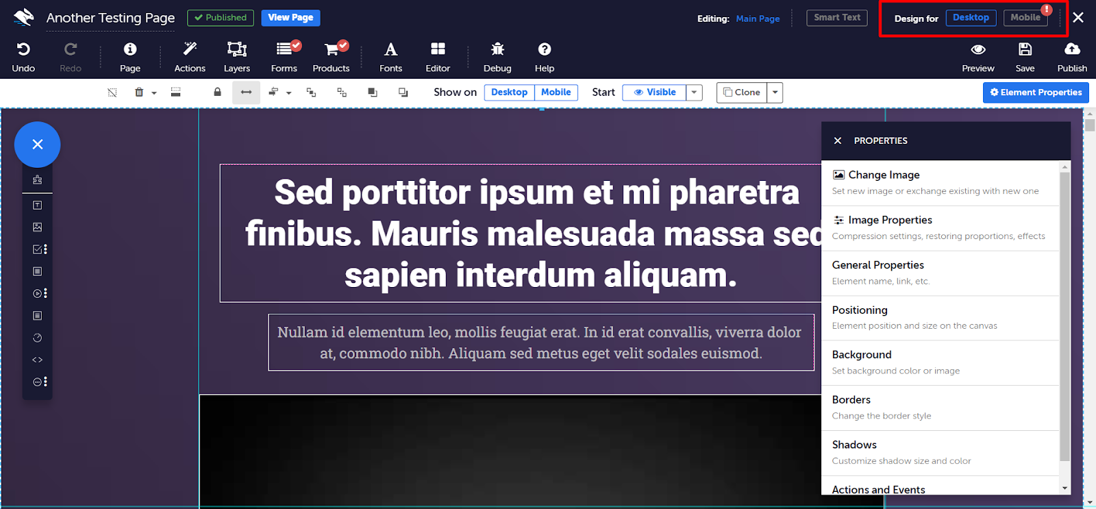
Convertri will automatically create a mobile version of your page as you edit. To access this mobile version at any time, click the Mobile button at the top of the Page Builder.
Convertri automatically scales your elements for a smaller screen in the mobile version. This means what you see in the Mobile Page Builder is always what you’ll get on mobile. That said, it’s always worth checking your page looks how you want it to before you publish.
The Remobiliser
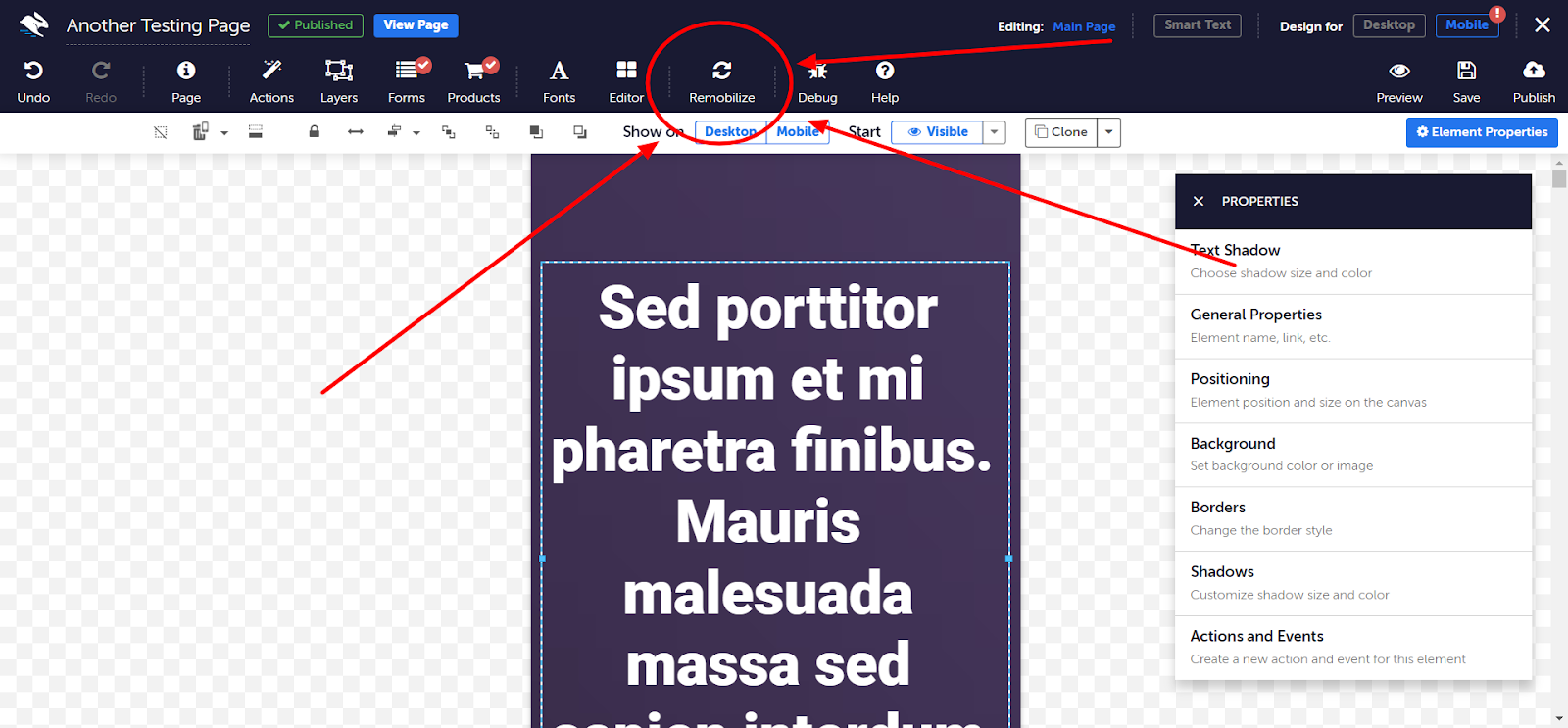
Each time you switch to the mobile view in editor, automatic remobilization is performed. That process performs appropriate resizing and repositioning of your page elements. It also ensures that Text elements have the appropriate height, since their width has probably changed (since the mobile view is much more narrow).
However, once you make any manual changes to the mobile view, automatic remobilization will stop and is no longer performed each time you modify your page. Therefore, if the auto-remobilization has been disabled (due to manual changes made to the mobile view), modifying the desktop content of your page, will not result in proper automatic resizing or arranging of the elements on your mobile version. So editing or adding any new elements to your desktop version, will result in your mobile page looking like a mess after the automatic remobilzation is stopped. You can click the remobilze button to reactivate it again at any time, but any of your manual mobile edits will be lost.
We recommend that you create your desktop version first, before making any manual changes to your mobile version, as making any manual change while still creating your desktop version will stop our automatic remobilization of your mobile version.
Free-form Editing
If the Mobiliser gets it a bit wrong, don’t worry - you can rearrange and resize elements in the mobile builder without affecting the desktop version.
You can’t add or delete elements, but you can hide certain elements on mobile and keep them visible on the desktop version. Here’s how:
- In the mobile view, select the element you want to show or hide on mobile.
- Toggle Show on Desktop/Mobile. On any greyed out option, your element will be invisible.
- If you hide an element on mobile in the mobile view and can’t find it again, switch back to the Desktop view (where it will still be visible) and toggle on Show on Mobile.

Text
By default, Convertri automatically scales your text to 150% on mobile to accurately reflect mobile scaling: on most screens, text that is 18pt on mobile looks the same as 12pt on a desktop.
But if you’d like to resize your text or edit your text, toggle ON ‘Allow text editing in mobile mode’ in Editor >>> Text >>> Allow text editing in mobile mode.

Then select on the text element you want edit or adjust, you’ll see options in the Quick Access toolbar
